To protect sensitive company information, I’ll be keeping some of the key performance metrics under wraps. I know, it’s a bummer. If you’re curious about the specifics, feel free to take a stab at estimating them.
They say, ‘If it ain’t broke, don’t fix it,’ right? Well, take a good look at this UI. You’d trust your billions with this thing? I don’t think so. Enterprise folks aren’t exactly thrilled about change, but let’s face it, we’re in the growth game. To keep up, we need to add features, please our users, and, you know, make some money. So, while it’s tempting to leave well enough alone, we can’t afford to stay stuck in the past.
After a year of wrestling with this clunky UI and muttering curses every time we needed to add a feature, a glimmer of hope appeared. Imagine a world with a modern, user-friendly interface that doesn’t make us want to pull our hair out. Could it be? A chance to replace this dinosaur of a UI with something actually decent!
Why waiting for 1 year?
In the consumer space, even a minor UI overhaul can significantly impact key metrics like conversion, acquisition, and retention. However, for enterprise product managers, a revamp without a clear business justification can be detrimental. Why? Because this…
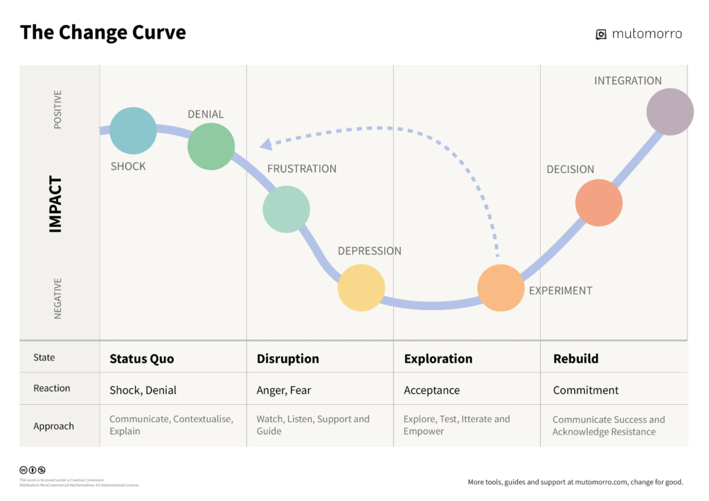
Oh look, 5 stages of grief but make it corporate. We’re all creatures of habit, right? And in the office world, we’re really stuck in our ways. Imagine your favorite work tool suddenly looking totally different. It’s like waking up and finding your coffee mug is now a soup bowl! You’d be like, “What the heck?” Denial, anger, trying to figure out how to fix it, feeling down about the whole thing, and finally, accepting the new normal – it’s the classic office drama.
Unless there’s a solid reason to change something, it’s generally best to leave it alone. So, what should you consider when thinking about a UI revamp? Essentially, it boils down to four key areas: getting new users (acquisition), keeping the ones you have (retention), making money (monetization), and saving cash (cost optimization). If your plan can improve all four of these, you’re practically guaranteed management’s approval.
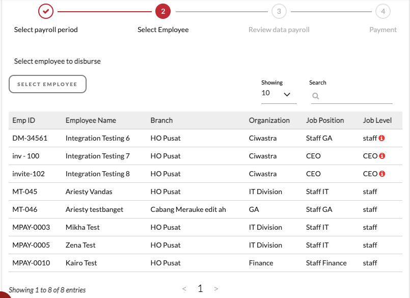
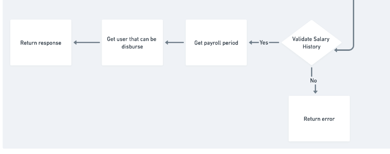
Your North Star metric for payroll disbursement is the #total amount disbursed/month. To reach this goal, you’re tracking key performance indicators like the #of accounts processed and #of active companies. These metrics provide insights into areas where improvements can be made to increase the overall disbursement figure. Since you can’t magically increase employee salaries, you’re focused on finding other ways to boost those key performance indicators. *Cries in UMR*
We’ve got a big fish on the line – a huge company wants to use our payroll system, PaDi. But there’s a catch: they need to split up employee payroll into different accounts. That’s a pretty big deal, right? So, we’re thinking about building a new feature to handle that and hopefully reel in this new customer. And I don’t think you can build something on top of this?

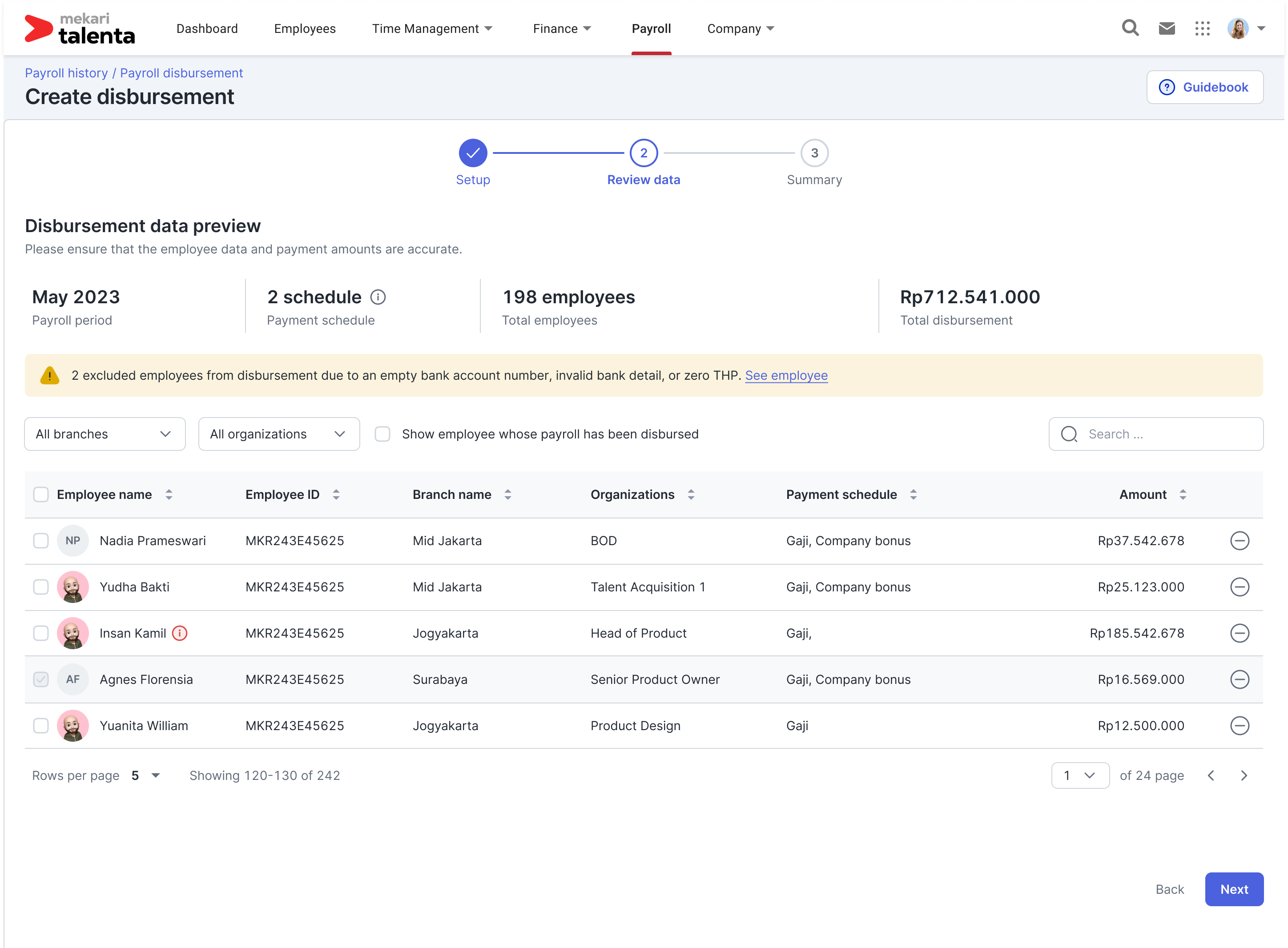
The current UI is less than ideal, to put it mildly. It’s clear that a complete redesign is necessary, as building upon the existing framework won’t suffice. The user interaction will also require a significant overhaul. We’ve initiated the initial phase of this project. Okay first case has been build.
Before making any changes, we need to determine what exactly needs improvement. Traditionally, we’d rely on user interviews or customer satisfaction surveys. While these methods provide valuable insights, they might not accurately reflect real-world user experiences.
As an alternative, the research team analyzed previous quarter support tickets to identify recurring issues. This approach offers a more grounded view of user pain points. However, it’s essential to remember that these issues might not represent the current situation
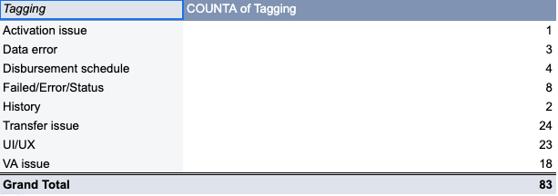
While UI/UX issues were initially highlighted, our investigation revealed that transfer and virtual account (VA) problems were also significant contributors. Upon closer examination, we found that these challenges stemmed primarily from RTGS and LLG transfers. Since Talenta only supports a limited number of bank VAs, users often resort to these methods, which have longer settlement times. Additionally, manual input of details like amount, account name, and number for RTGS and LLG transfers increases the risk of errors.
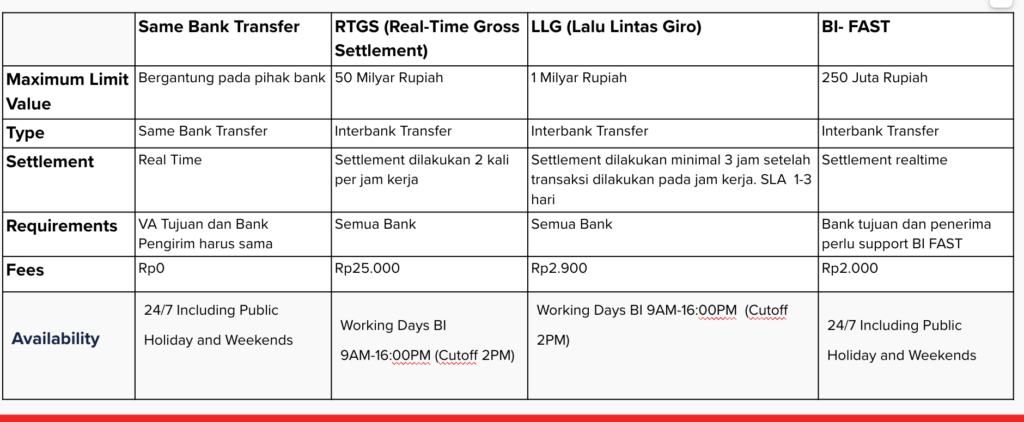
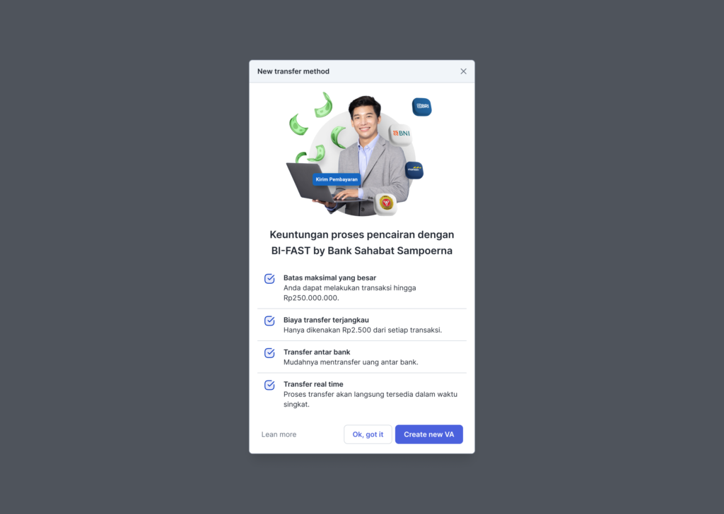
So there is a new payment method in the town which is BI-FAST. Our payment gateway partner’s BI-FAST-enabled VA could be the key to unlocking a smoother, faster payment experience for our users. It’s like upgrading from dial-up to fiber optic internet – it’s that big of a deal.
But does it? A critical factor to consider is BI-FAST’s maximum transaction limit. To assess its suitability for our user base, we analyzed the distribution of transfer amounts for micro and small businesses. Our findings indicate that the median transfer value for this segment falls below the 250 million Rupiah BI-FAST limit. This suggests that BI-FAST has the potential to significantly benefit these businesses by eliminating the need for higher-cost, slower transfer methods like RTGS and LLG, while providing a superior user experience through real-time transactions. The actual data looks something like this.
To capture larger enterprise clients, we need to expand our payment options beyond the current PaDi system. By analyzing user account data, we can identify patterns in single bank destinations and determine which VAs to support next. This data-driven approach will help us tailor our offerings to meet the specific needs of enterprise clients.
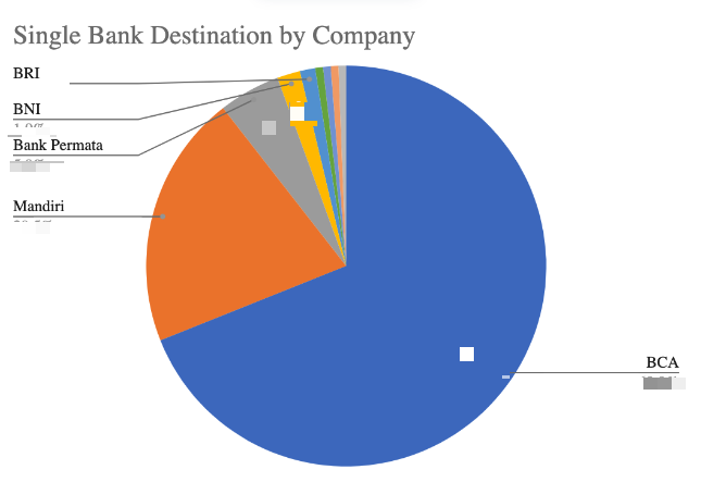
Data clearly shows that BCA is the most popular bank among our users, highlighting the importance of supporting it. While this might seem intuitive, having data to substantiate our decision is crucial.
Lastly, as this initiative is cross tribe, then we need to gain support from CFS Tribe. How we can gain their support? Yes, the key is to make sure its support their one of the key product key metrics which is #of ewa loan disbursed. But I will not deep dive into this part.
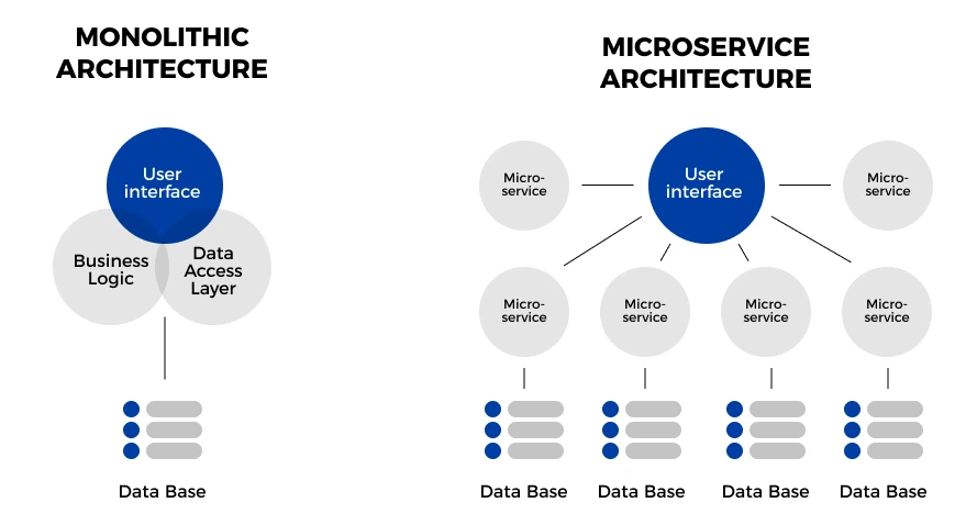
So we talk more about business perspective, how about the engineering perspective are they excited about this project? From an engineering standpoint, this project aligns well with their microservices strategy. By prioritizing scalability in the design, we can ensure a smooth implementation and future-proof the solution.
Design & Development: Devils In The Details
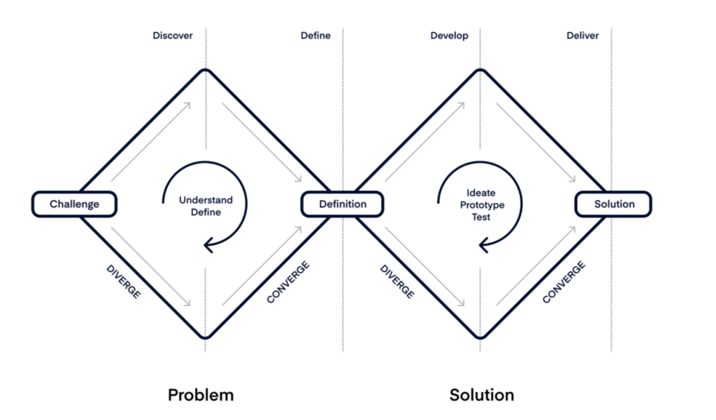
So now we have all key initiatives we want to develop. The next part how we design the interaction? Luckily I have great designer partners. Therefore I just need to list down the concern and they do the usual double diamond processes.
So here’s the peek of the result. So satisfying, so many things yet not so cluttered <3.

Anyway there is one of the “design manipulation” we do. Remember the BI-FAST transfer method? So actually the one that supported BI-FAST are BRI VA and BSS VA. However I “purposely” create an image that BIFAST VA can only be used for BIFAST Transaction. They support LLG, RTGS and Same bank transfer however we don’t advertise that and make it as if it is not supported to use other method other than BIFAST. Here’s why:
- People mess up, it happens. And guess who gets the blame when things go wrong? Yep, us. To save ourselves the headache of explaining stuff over and over, let’s just make BI-FAST the default.
- Let’s be real, how many companies actually use BSS as their main corporate account? Probably not many. That’s why capping transactions at Rp250,000,000 makes sense. It prevents misunderstandings about transfer limits and avoids comparisons with BRI VA, which is more widely used by corporations.
- Communicating the benefits of this new VA to our implementation, customer support, and customer teams will be straightforward. This means our support team can confidently promote BSS without any hiccups.
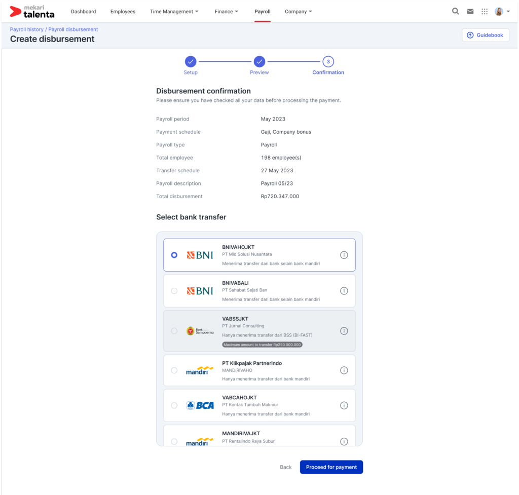
Anyway the full flow can be found here Link. We’ve already nailed down a solid design, so the next step is figuring out how to roll it out. To ensure a smooth transition and allow users to adjust at their own pace, we’ll introduce a toggle feature in the backend. This will give us granular control over the rollout process.
To prepare our users for the upcoming changes, we’ll send out a communication one week prior to the rollout. However, with multiple projects in the pipeline, coordinating a comprehensive rollout timeline is challenging. To manage this complexity, we’ve divided the process into several stages, as outlined in the image. This phased approach allows for controlled implementation and user adaptation. The most insane multi-staged rollout I ever run anyway for 1 module.
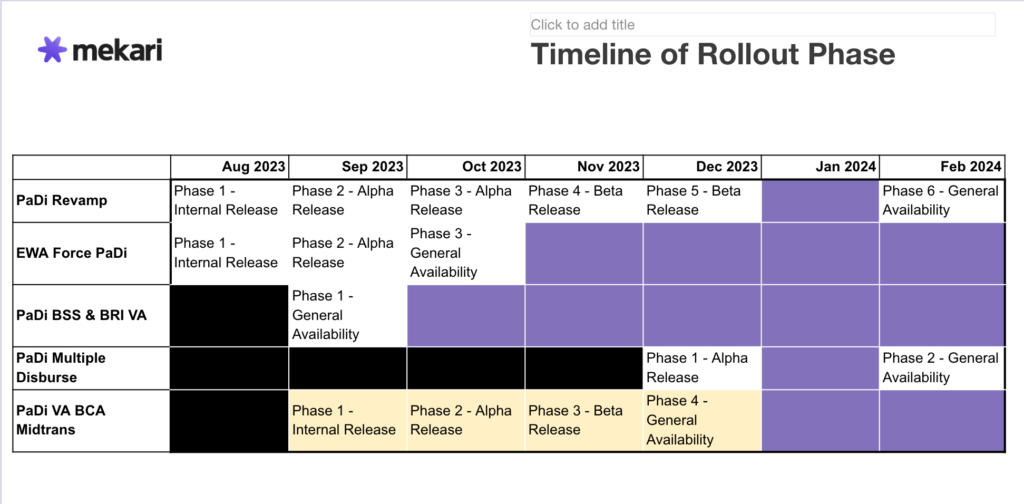
A phased rollout is essential to mitigate potential financial risks, as past experiences have taught us the high stakes involved (trust me been there done that). To proactively manage these risks, we’ll create a comprehensive risk matrix outlining potential challenges and their corresponding action plans. This proactive approach will ensure we’re well-prepared for any unforeseen circumstances. My future me is really say thank you to past me for creating this matrix.
Ready, Set, Go! Iterating and Listen to The Feedback
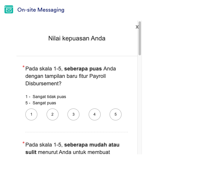
Ideally, we should have gathered baseline CSAT data before the revamp to measure the design’s effectiveness. However, lacking this, we’ll use the company’s overall elite CSAT score of 4/5 as a benchmark. To track progress, we’ll implement a monthly CSAT survey.
The metric has been set now let’s greet HR Community so they use this feature.
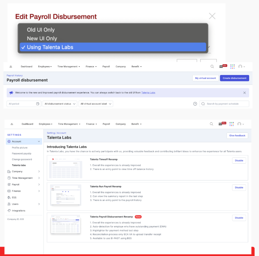
Yeah pretty much it is good conversion. In addition we also have in app announcement like this so people aware of the new capability.
Along the way, we review the CSAT form and found out similar interesting comment
“The new UI is so slow, sometime it freezes”
Do we believe their comment? No. But do we validate their feeling? Yes. So we look at the data on the Mixpanel.

So we track the funnel and try to take a look a the data. We found out that our new UI actually performs better with more than 50% improvement in speed to complete the payment. So what happen? We tried to replicate it with 8.000 employees. And we found out this issue…
We currently implement a bank account validation process before initiating payroll disbursement. This validation typically takes between 0.3 and 3 seconds per account, with an overall process time ranging from 1 to 4 hours depending on partner response times. In the previous UI, a disabled button indicated the ongoing validation process. While the new UI maintains the same functionality, the persistent button might create a perception of system unresponsiveness. This suggests that users have adapted to the previous behavior and may experience increased frustration with the new interface. Sounds like stockholm syndrome.
To keep our users in the loop and stop them from hitting refresh a million times, we’re adding a little progress bar. It’ll show them how long they gotta wait for the magic to happen.
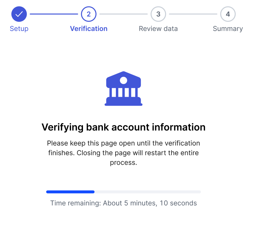
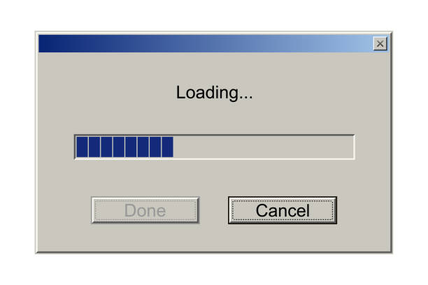
What is the catch? We cannot have exact ETA because we rely on partner. So what we do? Remember this old loading screen? Sometime we see it stucked at the end? So what if we give ETA not precise or even NOT ACTUAL CONDITION OF THE PROGRESS insane right? They will see as if it is always processing and the bar always progressing.
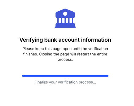
What if the process run faster than ETA? I mean, you guys will be cheering if it is happen do you? So it will jump as if it is finish earlier and go to the next page. But what if the opposite happen? Then we do infinite looping like this lol. We don’t know how long but plz wait.
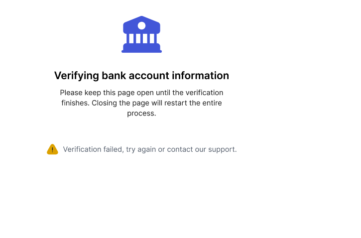
If it failed (but it rarely) to be honest it will show like this
Humans are so easily tricked, it’s crazy 🙁
Scale the Impact
So what is the impact of this initiative? Upon the release of this initiative, here’s the visible impact by the end of Q4
- # of New VA created more than x00 VA
- CSAT Score Average is 4.1/5
- # New companies onboarded for Micro Small achieving the targets
- Rp of GMV increased maintained in xx% increase MOM
- I’m not constantly annoyed by RTGS and LLG stupid transfer mistakes. Sorry I mean #of tickets related to UI UX and transfer issue has dropped
Crafting a winning UI revamp is no walk in the park. It’s a delicate dance between understanding your users, making data-driven decisions, and executing flawlessly. By placing users at the heart of the process and backing it up with solid data, we can create a UI that not only looks good but also delivers real value. Remember, it’s not just about making things pretty – it’s about creating an experience that users love and that drives business results.
Leave a Reply